It’s the post-PC era, where we use apps and mobile phones and tablets and ultra-books, e-books, iBooks, and Nooks. We Kindle and we Hulu and we tweet and tumblr and like. Everything is in a cloud somewhere. This is quite a change from the halcyon days of when computing meant sitting down at your computer and launching a program to do something; now all it seems we do (if you live in the digerati echo chamber, that is) is consume and critique.
That’s the context I perceive for this piece by Tom Scocca (@tomscocca) in Slate mocking Microsoft Word, which quickly went viral. Of the many Top Tweets about it, I found these two rather illustrative:
Most of the other tweets just repeat the author’s assertion that Word is “cumbersome, inefficient, and a relic of obsolete assumptions about technology.” The tweets above are useful in that they are explicit in their counter-assumptions about technology; namely, that the only real writing happens on the Web. It’s certainly true that using Word for simple text like email or blog posts is overkill, in much the same way that using a jet engine to drive your lawnmower is overkill. What’s peculiar is that rather than using simpler tools for their simpler tasks, these people have declared that the more complex and capable tool is “obsolete” and “must die”. This attitude betrays a type of phobia towards technology that I suspect has grown more prevalent as our technology interfaces have become increasingly more “dumbed down”.
In actuality, most of the writing in the real world is the complex variety that requires more than a few buttons for bold, italics and blockquote. Ask any lawyer writing a brief, a scientist writing a grant, or a student writing a dissertation how useful Word is and you’ll get a very different perspective than that of people writing tweets about how Word is too complicated for their blogging. Scocca himself acknowledges that he used Word when he wrote his book, which is a pretty telling reveal that completely undercuts his argument that Word has outlived its utility.
If I were to match Scocca’s hyperbole, I’d have to contend that Word is possibly the finest piece of software ever written, in terms of its general utility to mankind. That statement is arguably more true than claiming Word must “die” – especially since as of fiscal year 2011, Office 2010 had sold over 100 million licenses and drove record revenue growth. And note that the software division inside Microsoft that release Office for the Mac is actually the largest OS/X software developer outside of Apple, Inc. itself.
The reason that Word has outlived all its competitors, including dearly departed Wordperfect and Wordpro, is that it has evolved over time, to becoming an indispensable tool for a writer to save time and stay organized. Here’s a great list of 10 features in Word that any serious writer should be intimately familiar with. And even for casual use, some basic knowledge of Word’s features can let you do amazing things with simple text.
However, let’s suppose that you really don’t want to do anything fancy at all. You just want to write a plain text document, which is the basis of Socca’s argument. Is Microsoft Word really as bad as he makes it out to be? Here’s a quick summary of Scocca’s complaints, with my comments:
* Too many features that are left “on”. As examples, he uses the infamous Clippy (which hasn’t been in Word since 2003) and the auto-correct function (which is also enabled by default in Gmail, as well as TextEdit and OS/X Lion). If you really hate the autocorrect, though, it’s almost trivially easy to turn it off – a small blue bar always appears under the autocorrected word when the cursor is next to it. You can use that to access a contextual dropdown that lets you immediately undo the autocorrect or turn it off entirely, for example:

* Scocca finds certain features irritating, specifically “th” and “st” superscripts on ordinal numbers (1st, 2nd, 3rd, etc) and auto-indenting numbered lists. This is largely a matter of personal taste. Style manuals tend to recommend not using superscripts, out of concern on line spacing. Modern processors like Word can easily handle a superscript without breaking the paragraph’s layout.
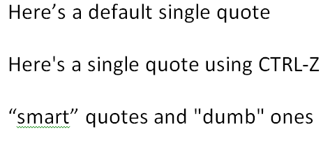
* He thinks that Word incorrectly uses apostrophes and quotes. He’s mistaken; see the image below where I demonstrate single and double quotes. Note that if you insist on using “dumb” quotes, you can immediately revert by using CTRL-Z (which every Word user should be familiar with, hardly “hidden under layers of toolbars”).

* For some reason, the logo for the Baltimore Orioles uses a backwards apostrophe. And for some reason, Scocca believes this is Word’s fault. I have absolutely no idea why he blames Word for this. Try typing O-apostrope-s (O’s) into Word and you’ll see that the apostrophe is indeed facing the right way. I’m frankly unclear on why the backwards apostrophe on the Orioles’ logo is a threat to civilization, but even if so, it’s not Word’s fault.
* Word uses a lot of metadata to keep track of its detailed and complex formatting. This has the effect of marginally increasing file sizes by a trivial and negligible amount (the files taking up space on your hard drive aren’t Word documents, they are MP3 files, video, and photos). Bizarrely, Scocca tries to cut and paste the metadata back into Word as proof of excess, but this is a completely meaningless exercise which proves nothing. It’s true that if you try to open a native Word file in a plaintext editor, you’ll see a lot of gobbledygook, but why would you do that? If you open a JPG file in a text editor you’ll see the same stuff. Every file has metadata and this is a good thing when you use the file in the software it is intended. Of course, Word lets you export your data to any number of file formats, including web-friendly XML and plain text, so Scocca’s ire here is particularly misplaced and mystifying.
* Scocca sneers that Word still uses the paradigm of a “file” on a single “computer”. He says it’s impossible to use Word to collaborate or share. Perhaps he’s unaware of the fact that as of last month, email-based file attachments have been around for 20 years? Microsoft also is lauching a cloud-based version of Office, though, called Office 365, and with the advent of tools like Dropbox and Live Mesh the old one-file-one-PC paradigm is no longer a constraint. It’s actually better that Word focus on words and not include network-based sharing or whatnot; there are tools for that, and isn’t feature bloat one of Scocca’s chief complaints anyway?
* and finally, he calls the Revision Marking feature of Word “psychopathic” and “passive-aggressive”. I wonder if he’s ever actually collaborated on a document? The revision feature has literally transformed how I collaborate with my colleagues and is probably the single most useful feature in Word. It’s trivially easy to accept a single specific change or to do a global “Accept All” between revisions and users. The interface, with color-coded balloons for different users in the margin rather than in-line is elegant and readable. Scocca gripes that “No change is too small to pass without the writer’s explicit approval” – would he rather the software decide which revisions are worthy of highlighting and which aren’t? This complaint is utterly baffling to anyone who has ever actually used the feature.
Frankly, as a regular Word user for years myself, I find it pretty hard to sympathize with Scocca’s rant. None of his feature complaints are really valid, apart from some stylistic preferences (he’d rather bullet his own lists, etc) which are easily modified in Word’s settings. If the menus are really so intimidating, it’s trivially easy to google things like disable autocorrect, and if your google-fu isn’t up to that task then you can always leave a post at Microsoft’s super-friendly user forums where ordinary users themselves will be glad to walk you through it.
If Microsoft Word were to truly die, then we’d lose one of the most productive tools for complex and professional writing in existence. If that’s the future of the written word, where anything above the level of complexity of a tweet, email or blog post is considered too hard to deal with (and software gets dumber to match), then it’s a grim future indeed.
Long live Microsoft Word!


